[2022/02/02] Daily Prebuilt has been redesigned since this article was written for an even better user experience. For more current Daily Prebuilt information, check out our most recent announcement post.
Hi there. Steve here with the Daily.co team. I am our Design Lead, and along with everyone I’m focused on improving our user experience and interface.
For those of you unfamiliar with Daily.co, here’s some background: Daily.co is really simple video calls, on your own URL. Like your-name.daily.co. It’s 1-click and personalized.
This personalization is more than just a feature to us — it’s core to our product experience. We hope to give you not just a more pleasant, beautiful experience, but one where you feel ownership: where you feel in charge.
Today, I’m really excited to introduce you to our brand new UI. This release is more than just a fresh coat of paint. Based on what our awesome users have been telling us, we’ve made some key changes.
When you open a Daily.co video call, you’re now greeted with the UI, shown in this quick clip:
There’s a lot going on here, so here are some of the key updates, with notes below on why we’re super excited about these benefits:
- Quick invite button, to share an invite easily
- A better in-meeting help experience
- Persistent controls, for fast access
- Easy camera and microphone switching
1. Easily invite others

What our users want most is to connect in seconds. For example, Daily.co calls are 1-click. Just click in Chrome…no downloads. What’s neat is to carry this simplicity and speed through every aspect of the video call. Being able to invite someone quickly, at any point during the call, is crucial.
We had thousands of users sign up when we launched as the #2 product on Product Hunt a few weeks ago, and many of our users first jump into a “test call” by meeting with themselves. It’s fun to see your video feed on your screen! There’s a strong emotional pull to invite someone, even if that wasn’t the original intent. The invite flow needs to be dead-simple.
Our new UI gives you fast access to “copy the meeting link.” Then you can simply share it however you prefer, like email, text, or Slack. (Note: for dedicated Slack users, we also have a standalone Slack Daily.co app, for video call links right in Slack, with dial-in.)
When someone else is in the call, your meeting link and dial-in information is displayed in their menu as well. We want to make it easy for you to invite your friends and colleagues to your video calls. Just click on the “Invite others” button to get more detailed meeting info!
Pro tip: The link in your Chrome address bar is also your meeting link. You can highlight and copy that as well!
2. A better in-meeting help experience
From the day we launched in Spring 2016, we supported 2 different products. free calls in your browser, and also a hardware upgrade for conference room TVs. For both free and paying customers, we’ve always offered live chat support when we’re online in San Francisco (PT, GMT -8).
Pretty often, we reply to chat in minutes, if not seconds. Our customers love it! Our response time, as well as our enthusiasm, helps set us apart. And the feedback we get is invaluable.
However, previously for web calls, the menu was placed in the lower right-hand corner of the browser window. By the way, here’s that old UI:

As you can see, the help link was starting to get lost. Also, when someone clicked to chat with our support team, the chat window would cover the menu. This meant that our customers were forced to close the chat to use the menu controls (mute camera, screen share, etc.) during a support call — not a great experience! This certainly was a priority to fix.
Our new UI repositions our main meeting controls: screen share, camera, microphone and our new more (settings) option to the left of the screen. Secondary controls, like invite, help and leave are placed to the right.
In short, you can now chat with us for help — by clicking the “Get help” button — and use your meeting controls!
3. Persistent controls
As seen above, our menu is now constantly visible. It no longer hides or moves based upon what is happening in your call. Before, for example, the menu would hide if you maximized someone’s video feed or a screen share. While that felt right at the time, we learned that those transitions could be confusing. Also, a muting camera/mic is a key action during a video call and hiding the menu forced users to take 2-clicks to mute. Now, it’s a fast one-click, so you control your call experience quickly and efficiently.
4. Camera/mic switching!
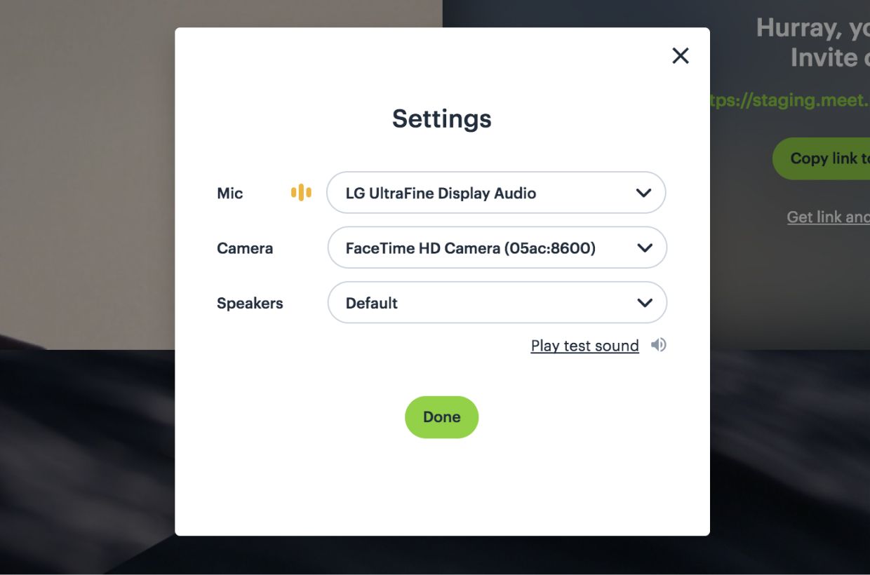
You can now switch your camera, microphone or speaker settings from inside of you call! We are really, really happy to have released this update. Previously, users had to open up Chrome’s setting and manually change the camera. Pretty painful.
To accomplish this my colleague—and one of our brillant Software Engineers—Izabella explains:
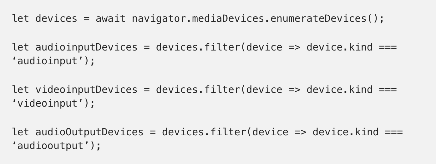
We use enumerateDevices() method on the WebRTC’s MediaDevices object to obtain an array of MediaDeviceInfo objects for available devices. That’s how we can detect the input and output devices that are both built in, or plugged in, to your computer.

We basically get the devices list and filter it to have three separate arrays of audio input, video input and audio output devices. You can select the desired device and use it in your meeting! You can also switch between devices during your call.

To change your settings, just hover over the “More” button and select “Camera/microphone settings”. You’ll be able to select whichever peripherals your operating system detects….all without leaving the call!
5. Bug fixes and UI polish
Finally, we’ve fixed a few bugs in this latest update and have polished our UI:
- Audio now sends over HDMI connections to external displays. Thanks for the bug reports here!
- Cleaned up our waiting room bar (shown when others are attempting to join a locked meeting)
- Pixel polish: cleaner rules, spacing etc. (since as a designer I’m obsessed with our pixels)
- Responsive fixes and adjustments
As always, thanks for using Daily.co and reporting any bugs, filing any comments and keeping us true to our word. It’s your feedback that really helps make Daily.co better!
